Picture Power Quick Shots
how to teach color contrast in photography

Understanding the three types of color contrast in photography is crucial for any aspiring photographer who wants to create visually striking and impactful images.
By utilizing color contrast, photographers can direct the viewer's attention to the most important elements of the photograph and create a sense of balance and harmony.
Color contrast in photography refers to the difference between two or more colors in an image. It is a tool used by photographers to create visual interest, highlight certain elements, and add depth to an image.
There are three types of color contrast in photography:
complementary contrast

This is when two colors that are opposite each other on the color wheel are used in an image. For example, red and green, or blue and orange. This type of contrast creates a strong visual impact and makes the colors stand out.
Here's an activity that teaches complementary contrast:
Materials needed:
- Camera or smartphone with camera
- Color wheel (can be printed or found online)
Instructions:
- Have the students select a subject or scene to photograph.
- Ask them to use the color wheel to identify the complementary color of the main color(s) in the subject or scene. For example, if the subject is a red apple, the complementary color would be green.
- Instruct the students to compose the photo in a way that emphasizes the complementary contrast between the two colors. Encourage them to experiment with different angles, lighting, and distances to see how it affects the contrast.
- Review and discuss the photos as a class, focusing on how the complementary contrast adds visual interest and impact to the images.
This activity not only teaches the concept of complementary contrast, but also encourages students to think creatively and experiment with composition. It can be adapted for different age groups and skill levels by adjusting the complexity of the subject or scene and the level of guidance given in composing the photo.
Similar contrast

This is when colors that are close to each other on the color wheel are used in an image. For example, yellow and orange, or blue and purple. This type of contrast creates a more subtle effect, and can be used to create a harmonious and calming mood.
Materials Needed:
- Digital camera or smartphone with camera
- Color swatches or colored paper in varying shades of the same color
- Natural light or a well-lit indoor space
Instructions:
- Begin by introducing the concept of similar color contrast and explaining that it involves using colors that are close together on the color wheel.
- Show examples of photographs that use similar color contrast and discuss how they create a harmonious and calming effect.
- Give each student a set of color swatches or colored paper in varying shades of the same color (e.g. shades of blue or green).
- Have students find a well-lit space indoors or go outside and take pictures using their digital camera or smartphone. Instruct them to focus on finding objects that match the shades of the color swatches they were given.
- After they have taken their photos, have students review their photos and select their favorite one that shows similar color contrast.
- Once students have selected their favorite photo, have them print it out or project it on a screen for the class to see.
- Ask students to share their photos with the class and discuss how they used similar color contrast to create a visually pleasing photo.
- Encourage students to experiment with different shades of colors and see how they can use similar color contrast to create different moods and effects in their photos.
- Wrap up the activity by reminding students that similar color contrast is a useful tool in photography and can help create a sense of harmony and unity in their photos.
Contrast of saturation

This is when colors that are fully saturated are placed next to colors that are less saturated or desaturated. This type of contrast creates a sense of depth and can be used to create a focal point in an image.
Materials:
- Cameras (phones or digital cameras)
- Color swatches or paint chips in a variety of colors and saturations
- Access to outdoor or indoor locations with colorful subjects or objects to photograph
Instructions:
- Begin by introducing the concept of saturation contrast and its importance in photography. Explain that saturation contrast is created by placing two colors with different levels of saturation next to each other in an image, which can make the image more visually dynamic.
- Provide students with color swatches or paint chips of different colors and saturations. Ask them to pick two colors that are similar in hue but have different levels of saturation, such as a bright yellow and a muted yellow.
- Instruct students to find a location with colorful subjects or objects to photograph. Encourage them to look for subjects with a range of colors and saturations, such as flowers, fruit, or colorful buildings.
- Once students have found their subjects, ask them to take two photographs of each subject: one with the two colors they chose side by side in the frame, and another with the colors separated from each other in the frame.
- After students have taken their photographs, review them together as a class. Discuss how the placement of colors with different levels of saturation affected the mood or feeling of the image.
- Encourage students to experiment with different combinations of colors and saturations to create more dynamic and engaging images.
Extension: Have students create a series of photographs using contrast of saturation as the main theme. Encourage them to be creative with their color choices and composition, and to consider how the saturation contrast affects the overall mood or message of their images.

The activities outlined above provide a foundation for young photographers to understand and experiment with the concepts of hue, lightness, and saturation contrast. While these activities are just the beginning, they offer a starting point for further exploration and creativity.
Encouraging children to explore color contrast in photography is not only a fun and engaging way to learn about art, but also helps to develop important visual literacy skills that are increasingly important in our visually saturated world.
With practice and experimentation, children can learn to use color contrast to create images that convey mood, emotion, and meaning.
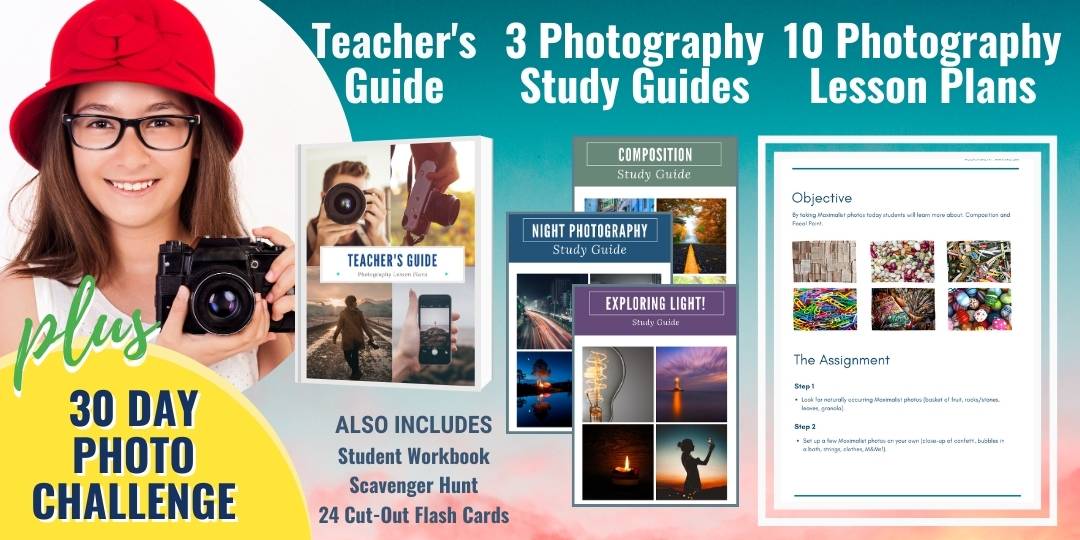
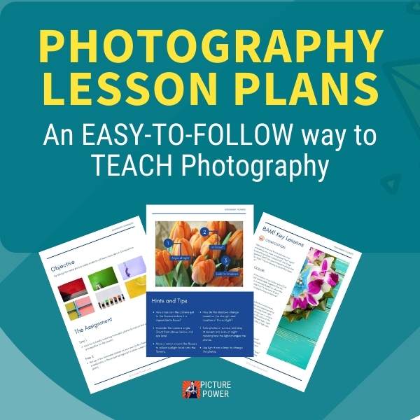
Photography lesson plans pack (Printables)
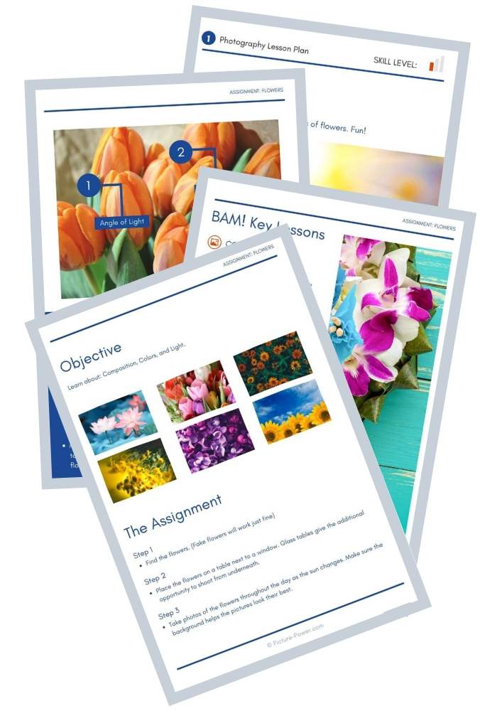
Jump right into teaching photography with our exclusive Photography Lesson Plans pack.
Includes:
- 10 Photography Lesson Plans
- 1 Teacher's Guide
- 3 Photography Study Guides
- 30-Day Photography Challenge
- 1 Student Workbook
- 24 Cut-Out Photo Flash Cards
- 1 Photo Scavenger Hunt
More from picture power


You might like these
7 Low Light Digital Photography Tips
The test of a good photographer is not how well they shoot in good light, but how they handle a low-light situation. Here are some basic tips on shooting low light digital photography.
Engagement Photo Ideas For Wedding Photographers And Couples
Whether you use props, matching outfits or a unique setting, get inspired with these engagement photo ideas.
Fun Photography Ideas | Tips for photographing toys and memorabilia
These fun photography ideas can turn a boring day into a day of adventure. Give your toys the attention they deserve and learn how to think like a cinematographer.


photography lesson plans pack


Search
Picture Power